Regression Analysis of Energy Consumption and Degree Days in Excel
We get a lot of questions along the lines of "how do I do this using degree days?" It's very common for the answers to involve regression analysis.
There are many text books and online resources that explain regression analysis in detail, but the theory can get a little heavy going. So we have written this article to explain only what is relevant for energy data analysis, specifically:
- how to do regression analysis of energy-consumption data and degree days in Excel;
- how to test regressions with degree days in multiple base temperatures, to help you choose the optimal base temperature(s) for your building(s).
If you want to get straight to analyzing your energy data, you could just use the regression tool on our website. It does everything described in this article and more, and it gives better results than Excel too (for reasons we explain in this article). Just visit the Degree Days.net web tool, select "Regression" as the data type, and follow the instructions from there.
But we do think it's worthwhile to understand the basic theory and Excel-based processes that we explain here. Even if you never actually use them in Excel, understanding them will help you understand how our regression tool works and how best to take advantage of it. Regression is key to most effective analysis of heating/cooling energy consumption, so it is important to understand it well.
On this page:
- What are degree days?
- Getting the necessary data
- Simple regression of energy usage against degree days (with no day normalization)
- Improved method for irregular data (with unweighted day normalization)
- The best method of all – weighted day normalization
- Multiple regression for when both heating and cooling are metered together
- Handling data from multiple fuels/meters (e.g. electricity and gas)
- What to do with your regression model once you have it
First things first, do you know what a degree day is?
Before diving into regression analysis, it helps to understand exactly what a degree day is... Our introduction to degree days should help.
Getting the necessary data
You will need records of your building's energy consumption, and degree days from a nearby weather station:
Getting the energy-consumption data
You might have detailed interval data from a smart meter, or weekly or monthly records of energy consumption that you've collected yourself, or energy bills from a utility or energy supplier.
Most buildings follow a weekly routine, which means that weekly energy-consumption data is typically a good option for regression analysis. Although the occupancy of a building and its heating/cooling patterns might vary throughout the week, the patterns are usually fairly consistent from one week to the next.
Monthly data is usually OK too, but it's rarely as good as weekly data, because the days of the week don't line up with calendar months (e.g. one month might have 5 weekends, the next might have 4). Unless your building is used in the same way on all 7 days of the week, these calendar mismatches will cause inaccuracies in your data analysis.
Daily data often isn't ideal either, because of consumption differences caused by different days of the week having different occupancy/heating/cooling patterns. Unless your building operates similarly for all 7 days of the week, it's usually best to sum daily data into weekly totals and do your regression analysis on those. Alternatively you can do separate regression analysis for occupied and unoccupied days (e.g. one analysis for Mondays to Fridays and another for Saturdays and Sundays).
If you have detailed interval energy consumption data (typically readings taken automatically every 60 minutes or less), you can use our Energy Lens software to turn it into daily, weekly, or monthly kWh figures.
You might not have much choice about what energy-consumption data you use for your regression analysis. But you should try to get energy data with at least 10 periods of measured consumption, and covering at least one full year (e.g. 365 days, 52 weeks, or 12 months) or a multiple of full years (e.g. 730 days, 104 weeks, 24 months, 36 months etc.), so that all seasons are represented equally. You can do regression analysis with less data, but you are less likely to get useful results.
If you're using energy data from your utility or energy supplier, make sure not to use any figures that are based on estimated meter readings. Estimated consumption figures are no use at all for this analysis!
Quite likely your building has multiple fuels (like electricity and gas), and multiple meters. It's usually best to analyze the energy data from each fuel/meter separately. We'll explain why later. For now just bear in mind that different fuels/meters feed different energy uses in a building, and the regression analysis we describe in this article is specifically for fuels/meters that feed at least some of the building's heating or cooling energy consumption.
Getting the degree-day data
If your energy data includes heating energy consumption, you'll want heating degree days (HDD); if it includes cooling energy consumption, you'll want cooling degree days (CDD). Degree Days.net provides both HDD and CDD for many thousands of weather stations worldwide, and you will almost certainly be able to find a good weather station near your building.
You will need degree days to match each period of measured energy consumption. Degree Days.net will generate daily, weekly, and monthly degree days, and it has a "custom breakdown" feature that will generate degree days to match your exact specified dates. This is useful if your periods of measured energy consumption are irregular. Alternatively you can get daily degree days and sum them together to make a total for each period. This should give you the same results, just with a little more work.
NB If you use our regression tool, it will assemble degree days to match your energy data automatically. But, to follow the process through in Excel, you'll need to download the degree days yourself, as explained above.
Simple regression of energy usage against degree days (with no day normalization)
Above we explained how to get the two sets of data (energy consumption and degree days). Now we will show you how to do a simple regression of energy consumption against degree days in Excel.
This is called "simple regression" because it uses just two sets of data: energy consumption, and degree days (either HDD or CDD, not both). This will work for energy data that includes either heating or cooling, but not both together on the same meter. If your energy data includes both (like for an all-electric building with both heating and cooling metered together), you'll need "multiple regression" (which we discuss later). Our regression tool will handle this automatically, but we suggest you go through this example anyway, as understanding simple regression makes it a lot easier to understand multiple regression.
The method we describe here does not use any day normalization. For this reason it is not the method we recommend, but it is fine if your periods of measured energy consumption are all the same length (like weeks, which are all 7 days long)... Shortly we will improve on this method by adding day normalization to make it more flexible, and to make it work better for monthly data and irregular periods of consumption.
Our explanation of the improved method is based on this one, so please do go through this method first.

We suggest you start by making 3 columns in Excel (or whatever spreadsheet software you use):
- Start of period – you don't need this for the regression, but it should be useful for keeping track of the data.
- Degree days – either HDD or CDD, depending on whether your energy data covers heating or cooling. (If it covers both heating and cooling on the same meter, you'll need multiple regression (discussed later), and realistically you'll need our regression tool to do that thoroughly.)
- kWh (or BTU, or litres of oil, or whatever units your records of energy consumption have).
For an example, see the screenshot to the right.
You can then use the second and third columns of data to plot a scatter chart of HDD (or CDD) on the x-axis and energy consumption on the y-axis.
Enhancing the scatter chart
Once you've made the scatter chart, you can add a "regression line", a "regression equation", and an R2 value. To add these in Excel:
- Right-click one of the data points and select "Add Trendline...".
- Make sure the "Linear" option is selected. We're doing linear regression analysis as we expect a straight-line relationship between degree days and energy consumption. (This linear relationship with energy consumption is one of the main reasons degree days are so useful!)
- Check the boxes to "Display equation on chart" and "Display R-squared value on chart". (In Excel 2003 and below you'll need to click the "Options" tab to find these checkboxes.)
You should end up with something like the chart below:

We can see from the chart that in this example the regression equation is:
y = 10.893x + 319.93
What does the regression equation mean?
- The
ycorresponds to the kWh (or BTU, or whatever your units of energy consumption are). We would usually call this "E", for "Energy", but Excel doesn't know that we're dealing with energy data so it uses a genericyinstead. - The
xcorresponds to the degree days (HDD in this example, but you could do a similar regression with CDD instead). - The figure that multiplies the
x(10.893in the example above) is a "regression coefficient" that represents the slope (or gradient) of the regression line. - The constant at the end (
319.93in the example above) is a regression coefficient that represents the intercept – the point at which the regression line crosses the y axis. You may also see it called the "constant". In theory it should represent the "baseload energy consumption" (see here for more on this), specifically in this example it represents the baseload energy consumption in a month (since we made the regression using monthly data, and without any day normalization). Generally you would expect this to be zero or positive (more on this later). In regression equations we would usually call it "b", for baseload.
A key part of "running a regression" or "doing a regression" is finding the regression coefficients. These are 10.893 and 319.93 in the example regression above, but they will be different for each regression you do. You don't need to understand how this process of finding regression coefficients actually works, just that Excel can do it for you as above (with limitations which we will cover further below), and our regression tool can do it for you too.
As the regression coefficients are different for each regression, we like to write regression equations in a more general form, like:
E = b + h*HDD

Where:

E is the energy usage over the period in question (a month in the example
  above);
HDD is the heating degree days over the period in question (a month in the
  example above);
b and h are the regression coefficients (different for every regression):
  b is the intercept or constant (319.93 in the example above), representing
    the baseload energy usage over the timescale that was used for the
    regression (a month in the example above);
  h is the slope of the regression line (10.893 in the example above).
The regression equation enables you to estimate energy consumption from degree days. By plugging a known HDD figure into the regression equation you can calculate the predicted energy consumption for the period that the HDD covered. (Or you'd use CDD if you had done your regression using CDD instead of HDD.) You can then compare the predicted energy consumption with the actual energy consumption for that period. You would typically do this to see whether the energy efficiency has got better or worse than it was in the period that you did the regression for. (Our article on calculating energy savings explains this more fully, but we suggest you finish this article first to get a better understanding of the regression process, as getting a good regression is critical to all analysis that follows.)
However, as this simple method does not use day normalization, the regression equation will only work for the timescale of figures that the regression was based on. For example, if you do your regression with monthly data (as in this example), your regression equation (with no day normalization) will only work for monthly figures. So you would have to plug in the degree days for a month, to get the predicted kWh for a month. The methods with day normalization that we explain further below are more flexible, and we recommend you use them instead. Though please do go through the rest of the notes for this simple method first, as the later methods build upon them.
What does the R2 show?
The R2 (or R-squared) value is a measure of how well the regression line fits the source data. It is a number between 0 and 1, and the closer it is to 1, the better the fit. We expect a linear relationship between degree days and energy usage, so we hope to see a high R2 value, the higher the R2 the better.
Generally speaking, an R2 of 0.75 suggests that our regression line fits the source data reasonably well. 0.9 or above is very good. An R2 much below 0.7 or so is likely an indication that either the control of the heating/cooling system is very poor, or the metered data or analysis methodology is poor (e.g. wrong base temperature, irregular building occupancy that hasn't been corrected for, heating/cooling metered together with other energy consumption that varies considerably throughout the year, and other such common issues discussed in Degree Days – Handle with Care!).
The example chart above shows a pretty good fit. In this instance you don't need the R2 value to see that – it's clear from looking at the chart... But R2 gives us a useful way to assess the fit objectively.
Even if the chart and R2 value show a good fit, quite likely you will be able to improve the fit by using degree days with a base temperature that better suits your building, as we will explain below:
Using Excel functions to test regressions with different base temperatures, to help determine the optimal choice
As explained in Degree Days – Handle with Care!, the base temperature of the degree days makes a big difference to how well they correlate with the energy consumption of any particular building.
The optimal base temperature varies from building to building. It's difficult to estimate the correct base temperature accurately for any particular building using logic alone, so it can be helpful to make a rough estimate (our article on choosing base temperatures should help) and then try regressing energy consumption against degree days with various base temperatures around that point. You can then compare the R2 values to find the regression (and base temperature) that gives the best fit with your energy data.
In theory, the base temperature that gives the regression with the highest R2 should be the optimal base temperature of the building. It won't always work out perfectly, because no simple statistical process can capture the full complexity of real-world building energy consumption, but it can certainly give you a useful indication. It shouldn't replace your intuition of what the base temperature should be, approximately, but it can help you decide which exact number to use. Generally speaking, the better the fit of your regressions (the higher your R2 values), the more faith you can reasonably place in your numbers.
Our regression tool automatically tests regressions with degree days in lots of base temperatures, to find the ones that fit best. But it is useful to try this in Excel too, to understand the process better.
The 3 relevant Excel functions are:
SLOPE: this gives you the slope (or gradient) of the regression line – thehcoefficient in a regression equation likeE = b + h*HDD.INTERCEPT: this gives you the intercept of the regression line – thebcoefficient in a regression equation likeE = b + h*HDD. As discussed above, this represents the baseload energy consumption.RSQ: this gives you the R2 value.
What's great about these Excel functions is that you can quickly apply them to multiple sets of degree days at once, each with a different base temperature, effectively creating a separate regression for each base temperature that you want to test. It won't give you visible regression lines on a chart, but it will give you the coefficients of each regression equation (using SLOPE and INTERCEPT), and an R2 for each regression too. And copying formulas across a spreadsheet is much easier than creating lots of individual charts and adding trendlines etc.
The screenshot below shows an example spreadsheet:
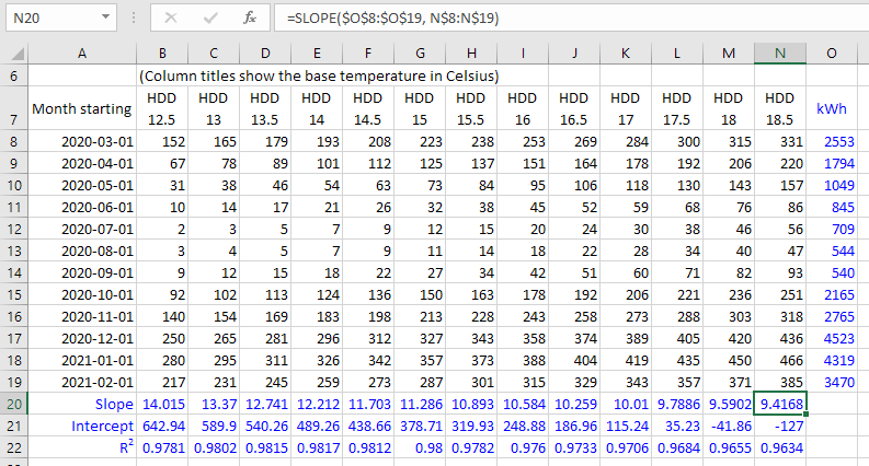
The above spreadsheet can be a little overwhelming on first glance, but it becomes clearer when we explain the steps to make it:
- Make a rough estimate of the building's base temperature (our article on choosing base temperatures should help).
- Select your estimated base temperature on Degree Days.net, check the "Include base temperatures nearby" box, specify a breakdown to match your energy data (see above), and generate and download the degree days. You'll notice that the data has been calculated to a range of base temperatures either side of your estimate. It will look a lot like the example spreadsheet above, but without the blue cells, which are the ones we added in ourselves (of course you don't need to make them blue unless you want to).
- Add your energy-consumption figures to the right of the last column of degree days, making sure that the period covered by each energy-consumption figure matches the period covered by the degree days to the left of it.
- Under the last column of degree days (column
Nin the example spreadsheet above), use theSLOPEfunction, selecting your energy-consumption values as theknown_ys(these are the values in columnOin the example spreadsheet above). - After selecting the
known_ys, hitF4to make Excel insert$signs in front of the row and column references (like$O$8:$O$19). The$signs "fix" the referenced cells so you can copy the formula without the referenced cells changing. - Next, for the
known_xspart of the formula, select all the degree-day values in the same column above (columnNin the example spreadsheet above). HitF4twice to put$signs on the row numbers but not on the column letters (this isn't essential, it just makes it easier to get the formulas forINTERCEPTandRSQlater). - You should have a formula something like the one you can see at the top of the screenshot above.
- Now, take the cell that you entered the formula into, and copy and paste it across the row, filling the cells under each column of degree-day data.
- Do similarly in the two rows underneath, using the
INTERCEPTandRSQfunctions instead ofSLOPE. You need to specify theknown_ysandknown_xsin the same way for all three functions. (As a shortcut, if you are comfortable with your$signs, to save doing theknown_ysandknown_xsreferences again, you can copy the rightmostSLOPEformula down, change the function names toINTERCEPTandRSQ, then copy across. But don't worry if this doesn't make sense, you can just doINTERCEPTandRSQin the same way you did forSLOPEabove.) - You should now be able to see the slope, intercept (baseload), and R2 value for each base temperature. These values can help you decide on the base temperature of the building, and provide you with a regression model to use for your further analysis (which we discuss later).
If you're new to using functions, formulas, and $ signs in Excel, it's likely that you found some of the steps above confusing. It's well worth taking the time to learn how these features of Excel work – they make it possible to do all sorts of things in seconds that would take minutes or hours otherwise.
Interpreting the slope, intercept, and R2 values
Generally speaking, in regression analysis of energy data, the regression coefficients should be positive. This is true for simple regression with HDD or CDD (which has just two regression coefficients: a slope and an intercept) and for multiple regression with HDD and CDD (which has three regression coefficients, and which we discuss further below).
If your regression has a negative slope, you might erroneously be using cooling degree days for heating energy data, or heating degree days for cooling energy data.
The intercept (the constant b) should be close to zero if you aren't expecting baseload energy consumption, or positive if you are, but not negative. For heating energy consumption, a negative intercept indicates that your base temperature is too high (so you should be using HDD with a lower base temperature). For cooling energy consumption, a negative intercept indicates that your base temperature is too low (so you should be using CDD with a higher base temperature).
Things get more messy when the heating or cooling consumption you are analyzing is metered together with other energy uses. If those other energy uses are significant, you should expect a significant baseload energy consumption (positive intercept). If you have a good estimate of how much energy those other energy uses consume, you can look for regressions with intercept values (b coefficients) that match your expectations of this baseload consumption.
Do bear in mind that baseload is a fuzzy concept, and in some buildings it varies throughout the year (meaning it's not really a "baseload" at all). Analysis is less precise when heating and cooling aren't metered separately from each other and from everything else. Do what you can with the figures you have, but don't be too surprised if the results don't come out as neatly as you would like them to.
Also take a good look at the R2 values. In theory, the base temperature of the building should be one that gives the highest R2 value. That's in theory though... In reality the various inaccuracies in degree-day analysis tend to muddy things up, and can cause misleading figures. Use the R2 values as an indication rather than an absolute, especially if your regressions don't fit well (i.e. you have low R2 values across the board).
If the numbers indicate that the optimal base temperature might be higher or lower than the range you have tested, you can download more degree days with higher/lower base temperatures and include them in your analysis. (Our regression tool will test a wide range of base temperatures automatically, so this is only a consideration if you are doing all your regressions in Excel.)
Improved method for irregular data (with unweighted day normalization)
Regressing energy usage against degree days, as described above, works OK when all the energy-consumption records cover identical periods of time. It's fine for regression analysis of daily or weekly data.
However, the above method doesn't work properly for irregular periods of consumption, like those gathered from records of oil deliveries...
What's wrong with regressing energy usage against degree days covering irregular periods?
The problem is with the baseload energy consumption. The method above assumes that the baseload is a constant number, but this assumption only makes sense if the periods of consumption are all the same length.
When records of energy consumption cover periods of varying lengths, the baseload energy consumption depends on the lengths in question. If the baseload is 20 kWh for a 1 week period, it will be 40 kWh for a 2 week period, and 60 kWh for a 3 week period.
Baseload energy consumption can't be expressed as a constant unless the length of the period is also a constant.
(If the above statement doesn't make sense, you might be confusing kWh with kW... Many people do! If you're in any doubt, take a look at our article on kW and kWh – it explains both units in detail.)
Because different months have slightly different lengths, using a constant figure for baseload energy consumption causes slight inaccuracies in regressions of monthly energy consumption against monthly degree days. With more irregular consumption records, these inaccuracies become greater.
Fortunately there's another approach that works better for irregular data (and just as well for regular data):
Adding day normalization to make the regression process work better for irregular data
Instead of regressing energy consumption against degree days, regress energy consumption per day against degree days per day.
For the previous method, with no day normalization, we regressed kWh against HDD. For this improved method, with unweighted day normalization, we regress kWh per day against HDD per day. Here's how we might arrange this data in a spreadsheet:

Let's explain each column in turn:
- The start date of each period, as before. We've added on an extra date at the bottom because it makes it easier for us to calculate the number of days in the last period (see the explanation for column D).
- The HDD of each period, as before.
- The kWh of each period, as before.
- The number of days in each period. This is easy to calculate in Excel. To calculate the number of days in the period in row 2, take the start date of the period in row 3, and subtract the start date of the period in row 2. The screenshot above shows the formula at the top so you can see what's going on. Once you've calculated the first value, you can copy the formula right down the column to calculate the number of days in each period.
- The HDD per day for each period. Calculate this by dividing the HDD by the number of days.
- The kWh per day for each period. Calculate this by dividing the kWh by the number of days.
Note that each HDD-per-day and kWh-per-day figure is an average for the whole of the period in question. The individual days within the period would presumably have had HDD and kWh that varied around the average. This is a bit like your average speed over a long journey – it's not a good indication of how fast you were going at any one time, but across the whole journey (the period) it makes sense.
Once we have the figures, we can create a scatter chart, just like before, except with HDD per day and kWh per day instead of HDD and kWh:

Like before, we can add a regression line (called a "trendline" in Excel) and equation. We can see from the chart that in this example the regression equation is:
y = 10.876x + 10.574
What does the regression equation mean now we are using day normalization?
- The
ycorresponds to the kWh per day (or BTU per day, or whatever-your-units-of-energy-consumption-are per day). As before, this includes both weather-dependent energy consumption (heating in this case) and non-weather-dependent (baseload) energy consumption. Also, as before, we would usually call this "E", for "Energy", but Excel doesn't know that we're dealing with energy data so it uses a genericyinstead. - The
xcorresponds to the degree days per day (HDD per day in this example, but you could do a similar regression with CDD per day instead). - The figure that multiplies the
x(10.876in the example above) is a regression coefficient that represents the slope of the regression line. - The constant at the end (
10.574in the example above) is a regression coefficient that represents the intercept – the point at which the regression line crosses the y axis. In theory this should now be equivalent to the baseload energy consumption per day.
So, for a simple day-normalized regression with HDD (as opposed to CDD), the equation is like:
E/day = b + h*HDD/day

Where:

E/day is the energy usage per day over the period in question;
HDD/day is the heating degree days per day over the period in question;
b and h are the regression coefficients (different for every regression):
  b is the intercept or constant which represents the baseload energy per day
    (10.574 in the example above);
  h is the slope of the regression line (10.876 in the example above).
But we can make this easier to work with, by multiplying both sides of the equation by the number of days, giving:
E = b*days + h*HDD

Where:

E is the energy usage over the period in question (which can be any period);
days is the length (in days) of the period in question;
HDD is the heating degree days over the period in question;
b and h are the regression coefficients (different for every regression):
  b is the intercept or constant, representing the baseload energy per day
    (10.574 in the example above);
  h is the slope of the regression line (10.876 in the example above).
This regression equation is similar to the one for the method with no day normalization that we described earlier. But this regression equation is easier to work with because you can apply it to periods of any length: days, weeks, months, years, or anything in between. Just remember that the baseload b is now a per-day figure, so, to calculate the predicted energy consumption E over any given period you have HDD for, you need to multiply b by the number of days covered by that period, as shown in the E = b*days + h*HDD regression equation immediately above.
Using this improved method to help determine the optimal base temperature
Earlier we explained a process for investigating the effect of base temperature on the regression analysis (see above). We used kWh figures and HDD figures then, but it's easy to apply the same approach using kWh-per-day figures and HDD-per-day figures instead. We need to insert a few additional steps between steps 3 and 4 of the 10-step process we described earlier:
- 3b) Calculate the number of days in each of our recorded periods (each month in our example).
- 3c) Translate the HDD figures into HDD-per-day figures.
- 3d) Translate the kWh figures into kWh-per-day figures.
- 3e) Follow the remaining steps described further above, but using the calculated HDD-per-day figures and kWh-per-day figures instead of the original HDD and kWh figures.
The screenshot below shows one way in which you could organize the data. It might be a little neater to put the HDD/day and kWh/day figures to the right of the original figures, but putting them below makes it easier to fit them all in a screenshot:
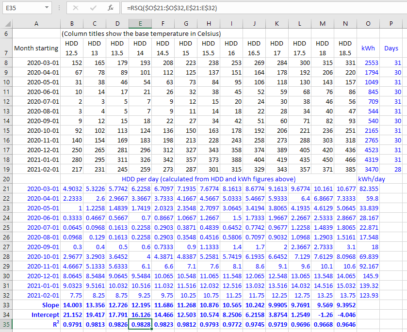
In Excel, the trick to calculating HDD-per-day figures across all periods and base temperatures is to:
- Calculate the HDD per day for the first period and the lowest base temperature, using a carefully-placed
$sign so the formula will copy well across multiple columns (base temperatures) and rows (periods). In this example we put=B8/$P8in cellB21, using a$sign to fix the "Days" columnP, but keeping everything else in the formula relative. - Copy that cell (
B21in this example) across all base temperatures and periods.
Provided you understood the previous examples, you should hopefully find this improved method pretty straightforward. But please let us know if anything is unclear. We appreciate that these instructions might be a little intimidating to anyone unfamiliar with Excel formulas and so on, but we're trying to make them as accessible as possible!
Also, do bear in mind that our regression tool will do all this automatically – it's only really necessary to do these steps in Excel to understand the process better.
The best method of all – weighted day normalization
The unweighted-day-normalization method described above is better than using no day normalization at all, but it is still not ideal if the periods have different lengths. The trouble is that all the periods of data going into the regression have the same influence on the resulting regression equation. Whereas ideally the longer periods would have a greater influence on the regression equation than the shorter periods.
Weighted day normalization is a method that weights the periods according to their length (in days) so that the longer periods have more influence on the regression calculation than the shorter periods. If all your periods are exactly the same length (e.g. weekly data with periods that are all 7 days long) this makes no difference at all and the results would be the same as with unweighted day normalization. But weighted day normalization improves the regression when the periods have different lengths, as, for example, they do in monthly data. The greater the variation, the greater the improvement of using this method.
The regression equation for weighted day normalization is the same as the one for unweighted day normalization (see above), and you would use it in the same way. Though unless your periods are all exactly the same length, the regression coefficients will be different (with weighted day normalization they will be more accurate).
Weighted day normalization is the method recommended by ASHRAE and others, and it is worth using it if you can. Unfortunately there is no easy way to do it in Excel, but it is possible to do it by duplicating the kWh/day and HDD/day values in each period according to the number of days in the period (so you would turn a 31-day period into 31 duplicated kWh/day and HDD/day values), and then running a regression on all the duplicated values across all periods (you can use the SLOPE, INTERCEPT, and RSQ functions for this, as before).
There is, however, a much easier way, as our online regression tool can do weighted day normalization automatically, as well as testing lots of base temperatures to find the ones that give the best statistical fit. Just visit the Degree Days.net web tool, select "Regression" as the data type, and follow the instructions from there. Weighted day normalization is the default day-normalization option as it works well whether the periods are all the same length or not.
Multiple regression for when both heating and cooling are metered together
The methods described above work for energy data that contains heating energy consumption (for which you would use heating degree days), and for energy data that contains cooling energy consumption (for which you would use cooling degree days), but they won't work for energy data that contains both.
When you have energy data that contains both heating energy consumption and cooling energy consumption, both on the same meter, the best approach is usually multiple regression. This will give you a regression equation like:
E = b*days + h*HDD + c*CDD

Where:

E is the energy usage over the period in question;
days is the length (in days) of the period in question;
HDD is the heating degree days over the period in question;
CDD is the cooling degree days over the period in question;
b, h, and c are regression coefficients (different for every regression).
It is possible to do multiple regression in Excel, using the Regression option provided by the Analysis ToolPak. The trouble is that you have to do this one regression at a time through the point-and-click user interface – there's no way to do it with Excel functions that you can easily duplicate across a worksheet – so it's not really practical to test different base-temperature combinations to find the optimal base temperatures. (We say "base temperatures" in the plural because usually the HDD base temperature and the CDD base temperature are different, with the CDD base temperature typically being higher.)
If you tested just 10 HDD base temperatures and 10 CDD base temperatures, you'd need to test 100 multiple regressions in total. 2500 if you tested 50 HDD and CDD base temperatures. It's just not practical to do this one regression at a time in Excel.
Also, just as weighted simple regression is best, weighted multiple regression is best too, but unfortunately that can't easily be done in Excel either.
Fortunately our online regression tool does weighted multiple regression automatically, testing thousands of different HDD/CDD base-temperature combinations to find the ones with the best statistical fit. Just visit the Degree Days.net web tool, select "Regression" as the data type, and follow the instructions from there. The regression tool will help you find your regression model (with the optimal base temperatures and regression coefficients), and then you can continue your analysis in Excel.
Handling data from multiple fuels/meters (e.g. electricity and gas)
Many buildings have multiple fuels (like electricity and gas) and multiple meters. You should consider each set of metered energy data carefully to decide whether you expect it to contain heating energy consumption, or cooling energy consumption, or both, as your regression models should contain HDD, or CDD, or both, accordingly.
It's usually best to do regression analysis on the energy data from each fuel/meter individually, as data from multiple sources combined usually makes it harder for the regression process to find clear patterns of weather dependency. Once you have a good regression model for each set of energy data, if you like you can combine the regression equations to make a model for the building as a whole.
For example, if there are two meters recording energy consumption E1 and E2, we can get regression equations for each individually, say:
E1 = b1*days + h1*HDD1
and
E2 = b2*days + h2*HDD2 + c2*CDD2
Then we can combine the two regression equations to give:
Etotal = (b1 + b2)*days + h1*HDD1 + h2*HDD2 + c2*CDD2
Note that HDD1 and HDD2 could have different base temperatures, as different parts of a building can have different thermal properties and usage patterns. However, if the base temperatures should logically be the same, you may decide to choose models with the same base temperatures for both, and then you could combine them into:
Etotal = (b1 + b2)*days + (h1 + h2)*HDD + c2*CDD2
Our regression tool will let you specify particular base temperatures that you want to include in the results, so you can compare their regression models with the ones chosen statistically. This is useful when you want to use the same base temperatures in regression models for multiple fuels/meters.
As mentioned above, regression analysis is usually best done on each fuel/meter separately. But sometimes it does make sense to strategically combine data from multiple meters before running regressions, such as when there are large numbers of meters and you just want a quick aggregate analysis, or when you have on-site renewable electricity sources (like solar PV panels or a wind turbine) and you need to combine them with metered mains electricity to get the electricity that is actually used (which is what matters for the regression). You'll have to use your judgement in these sorts of cases, but just bear in mind that combining data from multiple meters can easily average out the patterns of consumption that the regression process needs to work effectively.
Finally, remember that, in buildings with lots of metering, not all meters will have any weather-dependent energy consumption (i.e. no heating, cooling, or refrigeration). For these meters it wouldn't make sense to do regression analysis with degree days, and you would be better off analyzing the detailed patterns of consumption with software like Energy Lens.
If you're unsure whether a fuel/meter contains weather-dependent consumption or not, you can run its data through our regression tool to see if it finds a good correlation with HDD and/or CDD. Quite likely you'll find that the baseload-only regression with an equation like:
E = b*days
will be at or near the top of the shortlist, indicating that statistically it is as good or nearly as good as the best regression models that include degree days. This would suggest that there is no weather-dependent consumption in that particular set of energy data. (In normal circumstances when there is weather-dependent consumption, you'd expect the baseload-only regression to have considerably worse statistics than the top-listed regressions that include degree days.)
What to do with your regression model once you have it
The motivation for everything explained above, and for our regression tool, is to help you find a good regression model that represents the relationship between your energy data and heating/cooling degree days. This means you will have a regression equation with regression coefficients and degree-day base temperature(s) that are suitable for your energy data.
The more interesting analysis then comes from applying that regression model.
A regression model enables you to estimate energy consumption from degree days. Let's say you made your regression model using data from 2019. You could then take the HDD and/or CDD figures for 2020, and plug them into your regression equation to calculate the predicted energy consumption for 2020 – the energy consumption you would expect the building to have used in 2020 if it had operated as it did in 2019. You can do this for shorter or longer periods too.
Why would you want to do this? Well, when you have the predicted energy consumption for a period, you can compare it with the actual energy consumption for that period to see whether energy efficiency has improved or got worse, and by how much. This is the basis of the process we explain in our article on calculating/proving energy savings, which might be a good article to read next.
You can also use your regression model to monitor ongoing energy performance by making regular comparisons of recent energy consumption with model-predicted consumption (e.g. each day, week, or month). There are various ways to chart predicted and actual consumption too.
Generally speaking, getting a good regression model is a foundational step for most analysis of energy data that includes heating/cooling energy consumption and so needs some sort of weather correction/normalization. Hopefully this article and our regression tool will help you get better regression models, as these will improve the accuracy of all your subsequent data analysis.
Wishing you the very best of regressions going forward!
What next?
We have several other articles on degree days and how to use them effectively. If you are going through the recommended articles in order, then the next one explains how to calculate or prove energy savings using degree days and regression.
You can download degree days from our free website and use our regression tool from there too, by choosing "Regression" as the "Data type". It will automatically apply the regression techniques described in this article to help you get the best possible regression models for your energy data. It's one of many reasons to choose Degree Days.net over alternative data sources.
You might also like to read an overview of the Degree Days.net products that cater for the more sophisticated needs of many energy professionals, multi-site organizations, academic/government researchers, and energy-software developers who use our system. If you're looking for additional data, data for lots of locations, or automated access to data (in large or small quantities), our products can help!